📖Definition
A Venn Diagram is another visual representation of data. It is used to sort data into groups and shows how the groups overlap.
Each group of data is contained in a circle. The part where the circles intersect represents the overlapping of the groups ie. the items that belong to two or more groups.
Diagram
Method
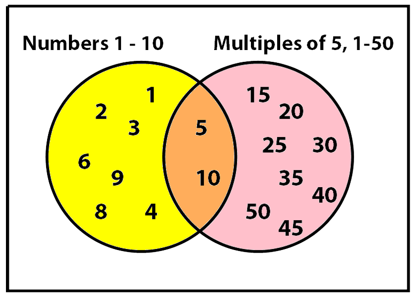
In the diagram above, the left hand circle contains the numbers 1 to 10. The right hand circle contains the numbers 1 to 50 that are multiples of 5 ie. 5, 10, 15, ....50.
The intersection (orange) contains numbers that are both in the left hand circle (1, 2, ...10) and in the right hand circle (5, 10, 15, ...50)
So, it contains 5 and 10.
💡Tips/hints
The same rules apply when there are three circles. Look out for the intersection of all three circles. It's shaped like a triangle with 3 bulging sides. This contains elements that belong to each of the three groups.
✏️Example
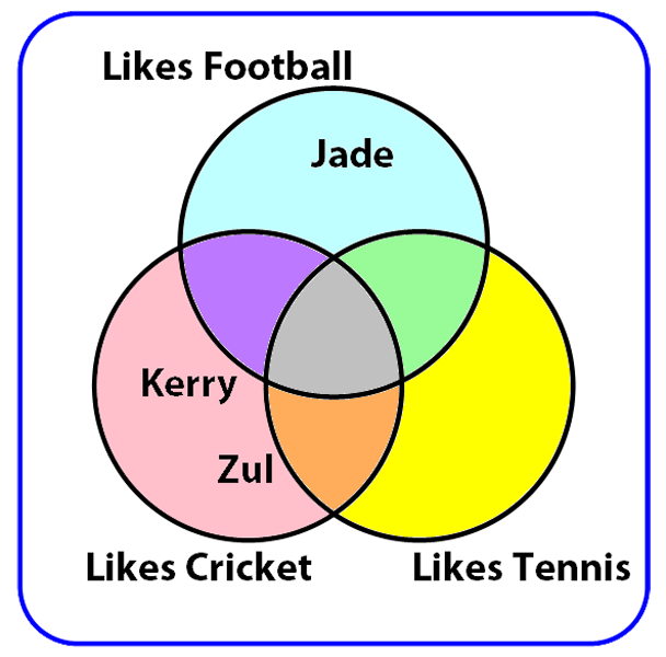
The pupils of year 5 have been asked which sports they like. Some names have been filled in already. Idris likes cricket and tennis but not football. Which colour segment should his name go in on the Venn Diagram?
Diagram
✅Solution
The Cricket and Tennis circles are the two at the bottom. The grey section in the middle is the area where all three circles intersect. The orange section below it is where the Cricket and Tennis circles intersect with each other but not with the Football circle. This is where Idris' name needs to go.