📖Definition
Graphs and Charts are visual ways of representing information.
Graphs
They can portray a number of things. For example:
How temperature changes over time
How to convert from one unit to another
Charts
Charts also can be used to portray a number of things. For example:
The distances between a number of locations
The price of different quantities of an item
Method
A Graph has two axes. These are usually labelled to tell you what they represent. Read the labels carefully and look at the scale. Both of these will be crucial to answering the question.
Normally you'll have to 'look up' a value on the graph. Look through the worked example to see how to do this.
Diagram
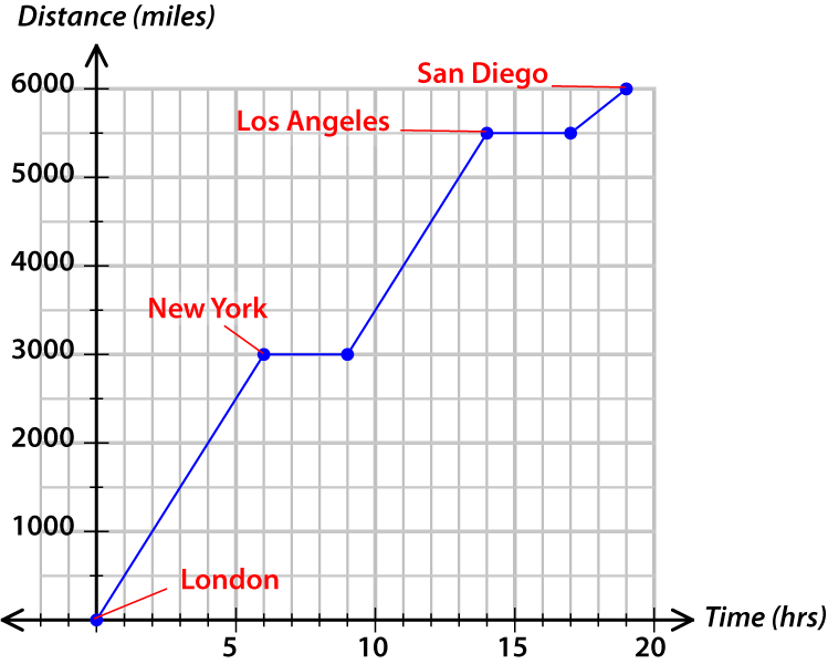
This is a travel graph. The x axis represents Time (hours spent travelling), the y axis represents Distance (miles travelled).
💡Tips/hints
If part of a travel graph is a horizontal line, it means that whatever is travelling has stopped. Time (on the x axis) is passing but no distance (on the y axis) is being gained.
When a line in a travel graph is moving up from left to right, the person travelling is going away from their starting point. If the line is sloping down from left to right, they're moving closer to their starting point.
✏️Example
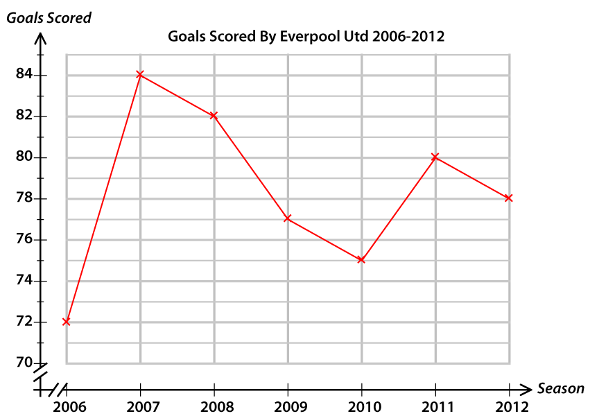
The graph shows the number of goals scored by Everpool United in the seasons 2006-12. How many goals did they score in 2010 and 2011 combined?
Diagram
✅Solution
We're given the years (2010 and 2011). These are shown on the x axis.
Find 2010 on the x axis and then look at the graph at that point. Now go across from that point to the y axis and read the value there. It's between 74 and 76 so it's 75.
Do the same for 2011 to find they scored 80 goals that season.
So the combined total for 2010 and 2011 is 155 goals.
✏️Example
The chart shows the distance in miles between various major cities in the UK. Which two cities are the same distance from Edinburgh?
Diagram
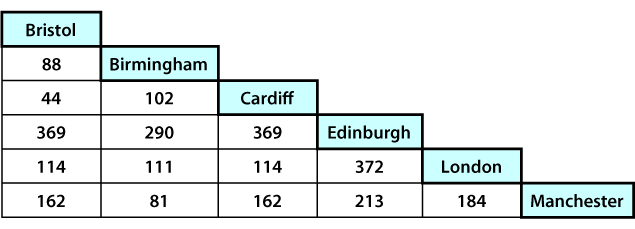
✅Solution
These charts can be a bit tricky until you know what to do.
Let's look at Edinburgh. The distances between it and other cities will appear where the Edinburgh row/column intersects with the other city's column/row.
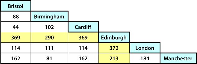
Diagram
These highlighted values are the distances between Edinburgh and the other cities. To see which city, go horizontally along the chart and read the name at the top of the column or go vertically down the chart and read the name at the right of the row.
The value 369 appears twice, in the Bristol column and in the Cardiff column.
That means both Bristol and Cardiff are 369 miles from Edinburgh