📖Definition
Bar Charts and Pie Charts are visual representations of data. They use Bars and Pie sectors (slices) to represent the frequencies of things. The taller the Bar or the bigger the Pie sector, the higher the frequency.
Diagram
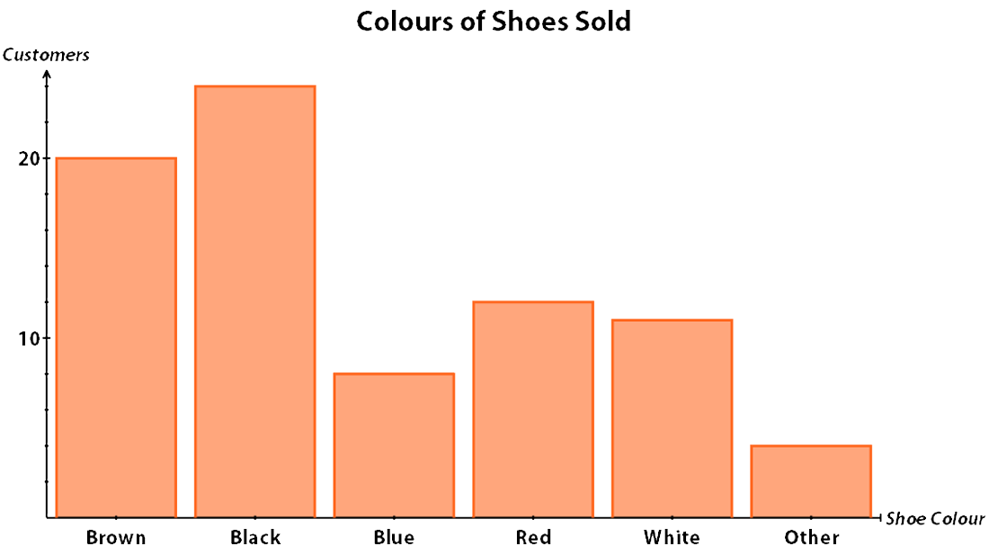
Bar Chart
This Bar Chart shows the number of pairs of shoes of a particular colour sold one Saturday in a shoe shop.
The horizontal axis shows the colour of the shoe, the vertical axis shows how many of each type were bought.
You can instantly see that Black was the most popular colour of shoe bought.
Use the scale on the vertical axis to work out exactly how many pairs of Black shoes were bought - it's 24
Pie Chart
A Safari Tour company logs the number of sightings of each type of creature. Here, the results of the previous month are shown in a Pie Chart.
Diagram
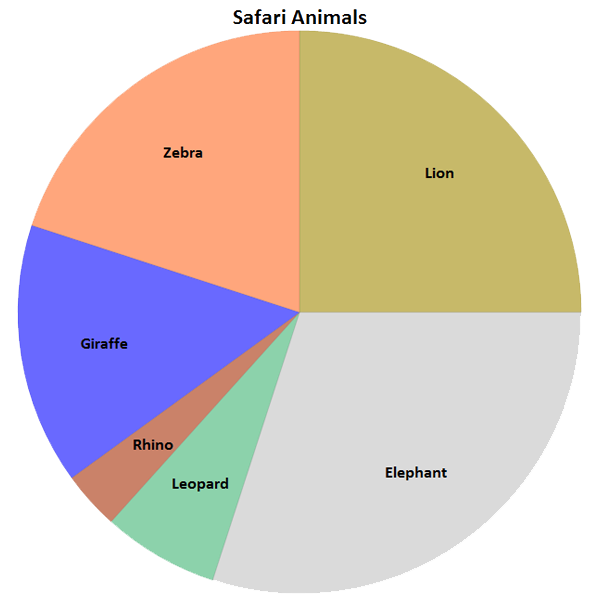
You can instantly see that Elephants have the biggest sector - that means that more elephants were seen than any other creature.
To find the exact number represented by the sector of a Pie Chart you must work out what fraction the sector is of the whole circle (Pie).
In the Safari Animals Pie Chart, the Lion sector is 1/4 of the circle.
So, if 120 animals were sighted in total 1/4 of them were lions ie. 30 lions were spotted.
Similarly, if you know the size of the angle, you can work out what number a sector represents.
For example, you're told that the angle of the Zebra sector is 60°.
The total angles at the centre of a circle is 360° so as a fraction of the whole circle, the Zebra sector is 60/360 = 1/6 of the circle.
So, out of 120 animals sighted, 1/6 were zebras ie. 20 Zebras were spotted.
💡Tips/hints
On a Bar Chart, to find the total number of occurrences, find the height of each bar and add all the heights together.
✏️Example
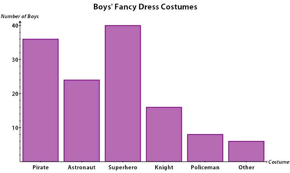
A school held a Fancy Dress party. The bar chart how many boys went in each type of costume. How many boys went as either a Pirate or a Policeman?
Diagram
✅Solution
Look at the scale on the vertical axis to see how high each bar is.
Each small line on the axis represents 2
So, 36 boys went as Pirates and 8 went as Policemen.
So, the total in these costumes was 36 + 8 = 44.
✏️Example
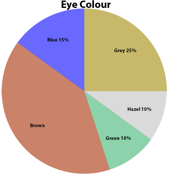
Sinitta did a survey on Year 6 to find out the colours of the pupils' eyes. She put the results in this pie chart.
If there are 60 children in Year 6, how many have brown eyes?
Diagram
✅Solution
The whole circle represents 100% of the pupils.
To find the percentage with brown eyes, we need to work out the percentage of those that don't have brown eyes and subtract this from 100%.
So, Blue + Grey + Hazel + Green = 15% + 25% + 10% + 10% = 60%.
So, 100% - 60% = 40% have brown eyes.
40% of 60 is (40 x 60) ÷ 100 = 24.